

Shoulder Rigid Boxes and Single Color Rigid Boxes: A Practical Buyer Guide
How Two Packaging Choices Shape a Better Unboxing Experience
Open any shelf of premium products and you will notice that the best packaging rarely shouts. It fits well, feels solid, and prints with purpose. For small brands, that balance usually comes down to two decisions: how the box is built and how much ink goes on it. This guide walks through both so you can decide with confidence.
Why Structure and Print Come Before Everything Else
Customers judge a product before they touch it. A study by Ipsos for Shorr Packaging found that 72 percent of American consumers say packaging design influences what they buy. That number explains why even a simple candle, cosmetic jar, or phone accessory deserves a box that feels deliberate. Structure controls the feel in the hand. Print controls the story on the surface. Get both right and the product looks more expensive than it is.
How a Shoulder Style Structure Works
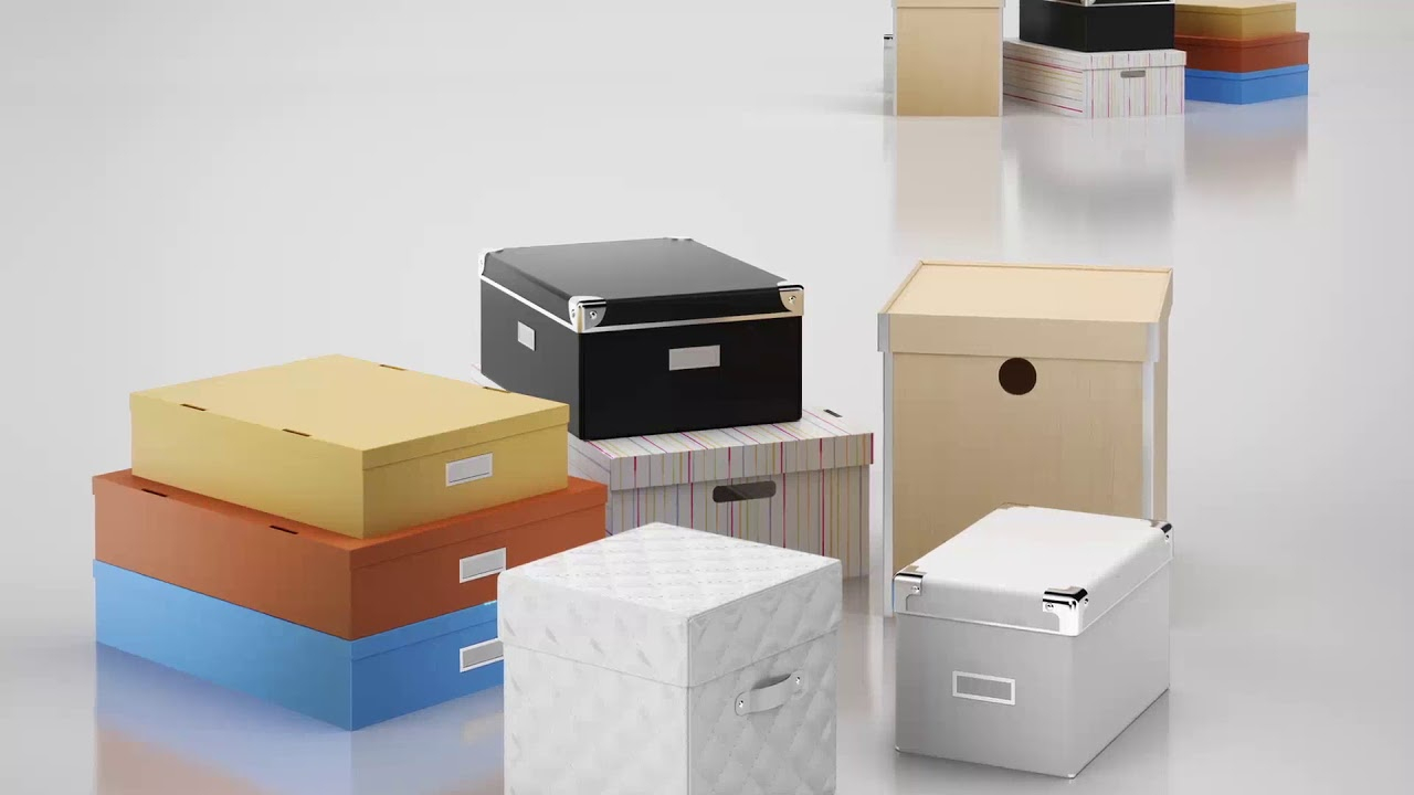
The base of this style has a raised inner ledge, and the lid sits down over it with a clean, snug fit. Shoulder Rigid Boxes are popular for fragrance, skincare sets, jewelry, and gift hampers because the ledge supports an insert and keeps the lid from sliding around.
Where it performs best
Products with a fixed shape and some weight benefit most. The ledge spreads pressure across the walls, so the box resists crushing during stacking. Add a foam or paperboard insert and the product stays still even when the parcel is tossed around in transit.
What to watch for
The extra layer of board means a slightly higher material cost than a basic lid and base. Measure your product carefully, because a gap larger than a few millimeters makes the lid look loose and cheapens the whole impression.
Why Less Ink Often Looks Better
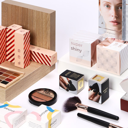
Printing does not need to be complicated to look premium. Single Color Rigid Boxes rely on one confident ink, often a deep black, a rich navy, or a metallic foil, set against a wrapped paper or textured stock. The result looks calm and modern, and it lets your logo carry the whole design.
Budget and consistency
Fewer ink passes mean fewer setup charges and less risk of color drift between batches. If you reorder every few months, a single ink keeps every run looking identical, which matters when customers compare old and new orders on social media.
Choosing the right color
Pick a shade that contrasts strongly with the paper wrap. Dark ink on kraft or ivory reads clearly, while light ink on dark board needs a test sample first because it can look weaker than expected.
Material and Finish Choices That Matter
Most rigid packaging uses greyboard between 1.5 and 3 millimeters thick. Thicker board feels heavier and more luxurious, but it also adds weight to shipping. The wrap paper is where personality shows up. Smooth matte paper feels quiet and elegant, linen texture adds tactile interest, and soft touch lamination gives a velvety feel that customers tend to remember.
Finishes such as embossing, debossing, and foil stamping work well with restrained designs because they add depth without adding color. A small debossed logo on a plain lid can look more refined than a full wrap of artwork.
Bringing Both Ideas Together
When you pair a sturdy ledge structure with restrained printing, the box feels intentional. Many brands order Shoulder Rigid Boxes with a plain wrapped surface, then add a single logo in foil on the lid. The structure provides the weight and fit, and the logo provides the identity.
This pairing also keeps production simple. Single Color Rigid Boxes are easier to proof, easier to approve, and easier to scale when your sales grow. You can always add embossing or a ribbon pull later without redesigning the whole package.
A Simple Checklist Before You Order
- Measure your product together with any protective wrap
- Decide on the insert material and how snugly it should hold the item
- Request a physical sample before approving a full run
- Confirm the minimum order quantity and the production lead time
- Ask how each finish changes the price per unit
Mistakes That Cost Brands Money
The most common error is ordering before testing a sample. Colors shift between screens and paper, and a lid that looked perfect in a mockup can feel too tight in real life. Another mistake is overloading the design. A brand that tries to print gradients, patterns, and three logos on one lid often ends up with a cluttered result.
If you are working with a tight budget, start with Shoulder Rigid Boxes in a small first run and review how they ship before scaling up. Real shipping feedback beats guesses every time.
Brands that test Single Color Rigid Boxes first often find that the clean look performs well in photos, which helps with online reviews and unboxing videos. Finally, remember that rigid packaging protects products well, but an outer mailer is still wise for long distance deliveries so the corners arrive sharp.
Frequently Asked Questions
How long does production usually take?
Most suppliers need two to four weeks after sample approval, depending on quantity and finishes. Ask for a written timeline before you pay a deposit.
Is printing with one ink really cheaper?
Generally yes, because there are fewer printing steps and less setup work. Foil and special coatings can raise the price, so request a quote with and without them.
Do I need an insert?
For fragile or loose items, yes. An insert keeps the product centered, reduces movement, and makes the opening moment feel more polished.
Final Thoughts
Great packaging does not have to be complicated. A solid structure, a clear logo, and a finish that matches your brand voice can lift an ordinary product into something people want to keep and share. Start with a sample, test it with a few real shipments, and let customer feedback guide your next order.